Improving a Platform's UX and Usability
Addressing critical user experience issues through a user-centered redesign, resulting in a 70% increase in customer satisfaction.
Overview
- The platform had several UX issues because it was developed mainly by programmers who didn’t pay enough attention to user journey and usability. Users couldn’t log into the app from the website, the buttons weren’t clear, and the most important part of the site that influences user decisions, the food images, wasn’t clear either.
- This project was especially interesting to me because it allowed me to experience Dutch work culture, work with a small international team, and follow my passion for cooking and food. Also, I really enjoyed the startup challenges, with the dynamic and free environment for trying new ideas.
- To solve these issues, I decided to review all areas of the business, improve user journeys, and identify the pain points. I started off as a UX designer, but as I worked on improving the platform to stay competitive, I naturally took on a product designer role. As in most startups, we had challenges with resources and time, and for some problems, we needed A/B testing to find the best solution.

In this project, my role was as a product designer, which was very similar to a product manager role. This was because I had a complete understanding of all layers of the project, which helped speed up processes and improve team collaboration.

01
Empathize with Users
To begin, I thoroughly reviewed the platform to understand user flows and the various processes users go through. My goal was to identify existing issues from the user’s perspective and get a clear understanding of the system. Based on my previous experience, I noted several pain points, such as confusing pathways and unclear options, that were causing frustration for users.
To validate these issues, I held a meeting with the stakeholder to access any existing user feedback. This allowed me to confirm that the problems weren’t just in my head, but were real challenges faced by actual users.
Next, I decided to conduct a usability test. I showed the platform to 10 of my friends and asked them to interact with it. This helped me identify problems users naturally face while navigating the system.
Finally, I requested that stakeholder create a chef account for me so I could explore the platform from the perspective of specialized users as well.
02
Define the Problem and Ideate Solutions
After receiving feedback from the product manager and stakeholders, as well as conducting my own analysis of the platform and user research, I created a list of the platform’s main problems and pain points. These issues were identified both through research and user feedback, and I divided them into two categories: user issues and product requirements. Once I prioritized them, the following key issues were identified:
- No access to the app from the website: There was no clear call-to-action (CTA) to encourage users to download or log into the app.
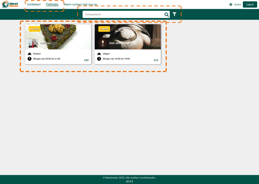
- Duplicate and unclear pages: There were two similar pages that confused users. Additionally, the food images, which should have been an important engagement factor, were not properly visible.
- UI issues with modals and filters: The modals had inconsistent design and poor contrast, and the filter modal did not accurately apply the user’s selections.
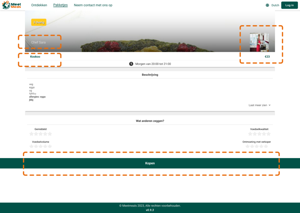
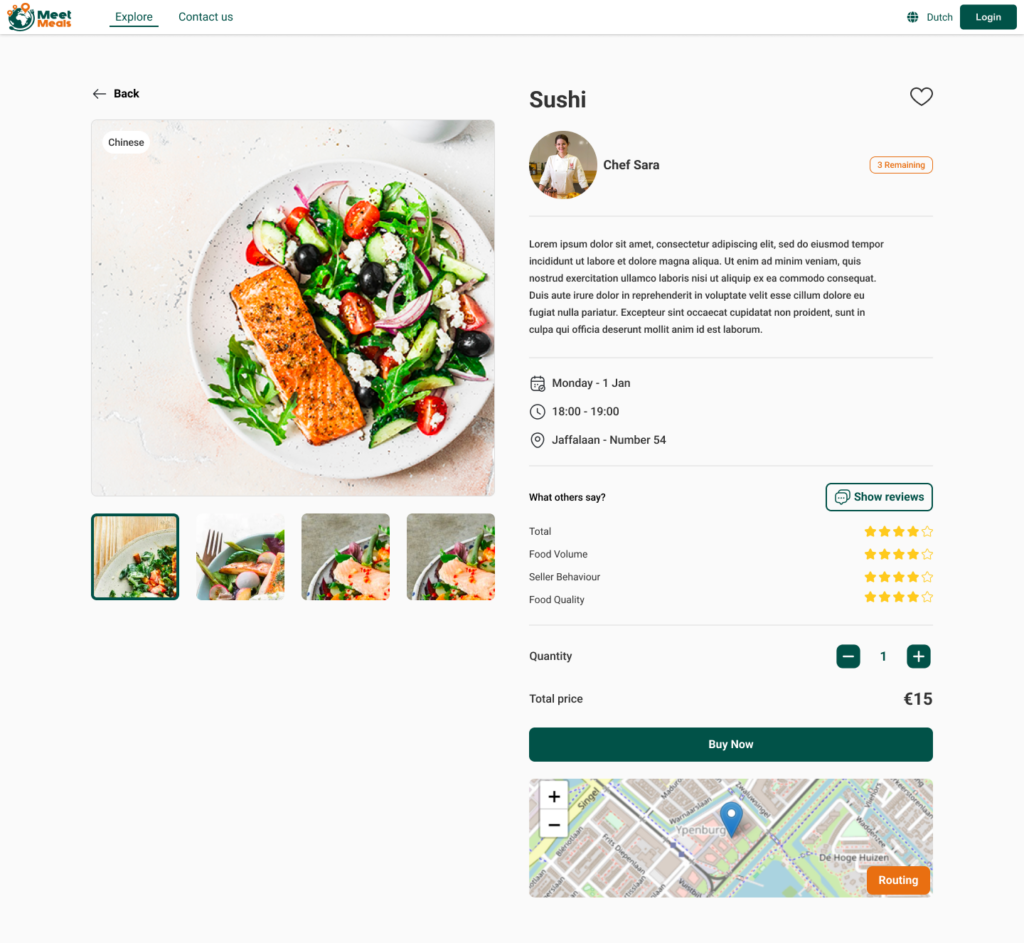
- Poor food card and purchase button design: The food cards and the information displayed were not visually appealing or easy to read. The purchase button was not prominent enough in the desktop and mobile versions.
- Lack of consistency in colors and fonts: Without a design system, the colors and fonts were inconsistent across different pages, making the user experience feel disconnected.
03
Proposed Solutions
To fix these issues and create a better user experience, I took the following steps:
- Prioritized the problems based on how they affected the user journey.
- Created a simple design system to ensure consistent use of colors, fonts, and buttons across the platform.
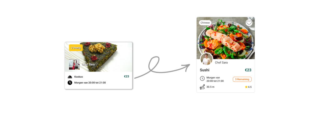
- Improved the food page and cards: I researched the best food and grocery websites and used this inspiration to design simple, beautiful food cards. I made sure the food images were more visible to increase engagement.
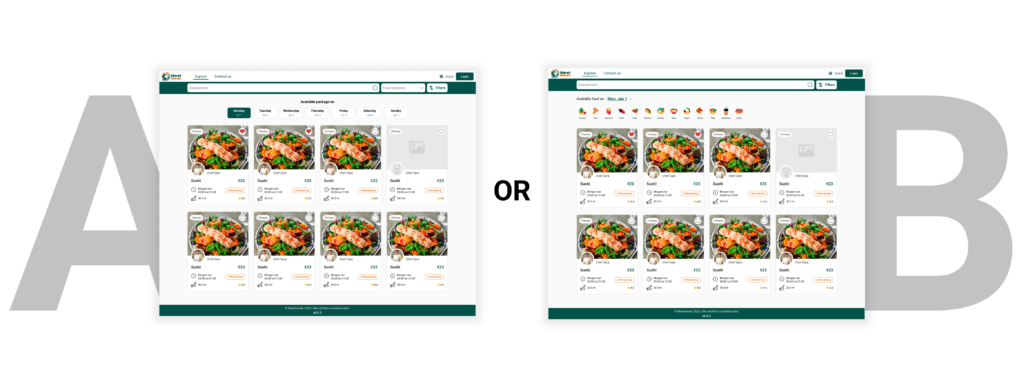
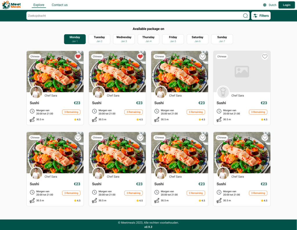
- Sorting food by day: One of the product manager’s requests was to sort food by day and category. After researching the market and talking to users, I came up with two possible solutions and decided to use A/B testing to determine which was best. After testing, we found users preferred sorting by day. I then made the day filter more prominent, allowing users to easily find their desired results with one click.
04
Design & Prototype
To begin the design process, I wanted to make sure the implementation was efficient and fast. Instead of starting from scratch, I first created a small design system to help the development team ensure consistency in the design. This approach made sure that everyone used a shared language for colors, fonts, and spacing, keeping everything cohesive throughout the platform.
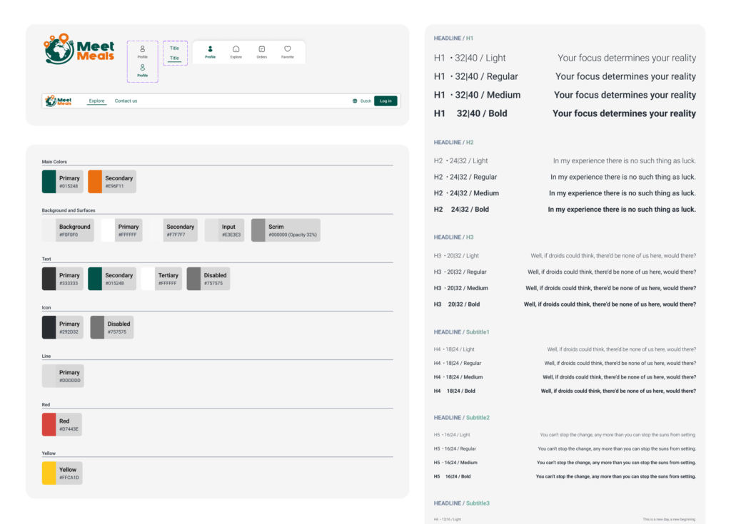
Once the foundation was set with the design system, I focused on resolving the UI/UX issues I had identified earlier. I took inspiration from best practices and user feedback, creating wireframes that addressed the main platform issues. I then reviewed each wireframe with the product manager to make sure they aligned with business goals. After finalizing the wireframes, I moved on to the visual design, making sure the solutions were both user-friendly and visually appealing.
To speed up the process, I used an iterative approach. As soon as one page was ready, I handed it off to the development team to be implemented, so the work could progress in parallel. This helped ensure the project stayed on track and on schedule.
One of the main design challenges was creating the food cards. I needed to ensure that users could quickly understand the information they needed at a glance. I paid close attention to maintaining the correct data hierarchy, ensuring that the most important details stood out, while secondary information remained easily accessible. Based on my previous experience, I considered that food names might get long, so I left enough space to avoid text overlapping.
To maintain contrast, I used borders and backgrounds in some areas to help users clearly distinguish between data and clickable buttons. The goal was to make the design simple, readable, and easy to navigate.
Another challenge was the filters, specifically the sorting of food by day or category. To address this, I decided to conduct an A/B test. I first created wireframes based on data and examples, then shared them with both current users and new testers. After gathering feedback, we found that users prioritized sorting by day over category. Based on this insight, I redesigned the day filter, making it more prominent and ensuring that users could get their desired results with just one click.
The final result was a real upgrade for the system. The changes led to a 70% increase in user satisfaction, and the stakeholders shared this data with me.
05
Testing and Implementation
After finalizing the designs and prototypes, it was time to evaluate the solutions through user testing to ensure they met user needs and design goals. The feedback from these tests was crucial for making final adjustments to the designs before development began.
First, I conducted A/B testing for key features, such as sorting food by day. This helped me understand user preferences and make more informed decisions. The A/B test results showed that users preferred sorting food by day over other options. As a result, I decided to highlight the days more in the design, allowing users to find what they needed with a single click.
Once testing was completed, I worked closely with the development team to ensure that the designs were correctly implemented. To streamline the process, I provided detailed design specifications and maintained ongoing collaboration with the team. As soon as a page or component was ready, it was handed off to the development team so the work could proceed in parallel.
One of the challenges during implementation was dealing with minor changes and adjustments after the initial deployment. For example, in the food product page, I wanted the food image to always be visible, even when scrolling, to draw users’ attention and encourage them to make a purchase. However, this feature wasn’t implemented correctly in the first version. After testing and receiving feedback, the issue was corrected. These kinds of minor adjustments are an important part of the design process, and I regularly report them to improve the final output.
During the implementation phase, I focused heavily on usability and performance to ensure that the final product was not only visually appealing but also user-friendly and intuitive. After the launch, I continued to monitor user feedback and made further improvements to enhance the system.
The final result was a 70% increase in customer satisfaction, as reported by the stakeholder, which showed that the project had successfully improved the user experience
05
Conclusion
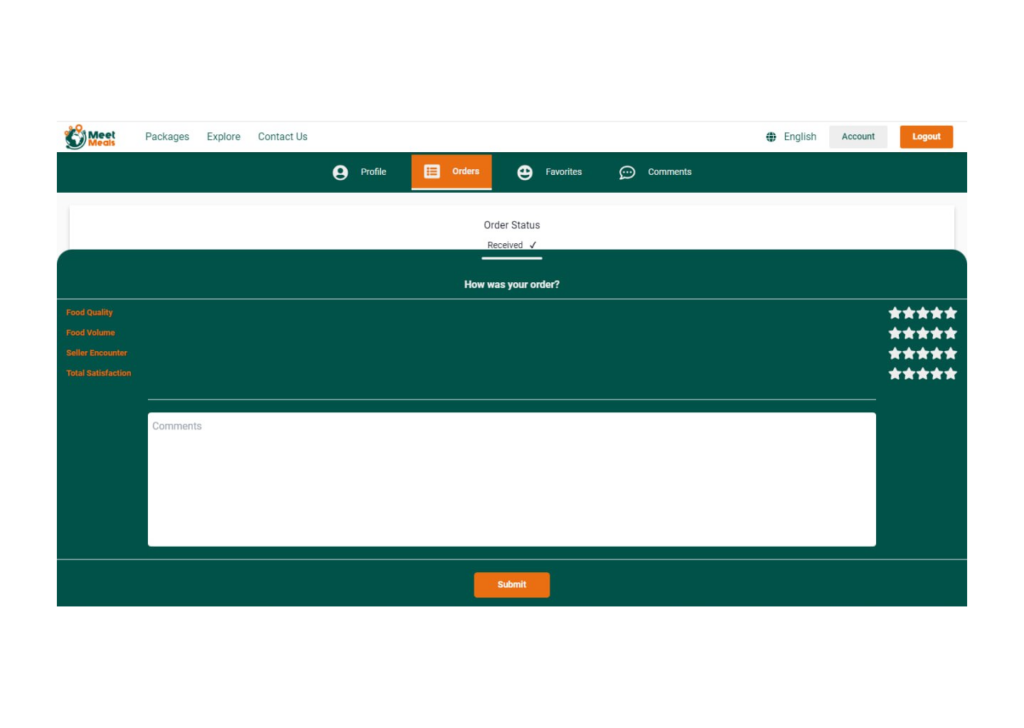
- After finalizing the designs and initial implementations, it was time to evaluate the results. The final product included refined designs, UI optimizations, and new features developed based on user feedback and collaboration with the development team. One of the key achievements of this project was a 70% increase in customer satisfaction, which clearly demonstrated the direct impact of the new designs on improving the user experience.
- Throughout the project, we faced several challenges, such as time zone coordination due to the remote nature of the development team, managing rapid changes, and maintaining design integrity with a reliance on the design system. Additionally, I had to pay special attention to the cultural differences and user habits because this was my first project working with a Dutch team. Issues also arose between design and development when implementing certain details, but these challenges helped us improve teamwork and refine how we present information to the user.
- From this project, I learned several valuable lessons, such as the importance of continuous feedback and the need to adapt to users’ evolving needs. These experiences reinforced the importance of ongoing collaboration with both the team and users to create products that effectively address real user needs.
- Looking ahead, the project will require further improvements to account for more complex processes and evolving user requirements. As a designer, I am always looking for innovative solutions and ways to optimize user experiences to ensure that digital systems continue to meet user needs at the highest level.
